

| 일 | 월 | 화 | 수 | 목 | 금 | 토 |
|---|---|---|---|---|---|---|
| 1 | 2 | 3 | 4 | |||
| 5 | 6 | 7 | 8 | 9 | 10 | 11 |
| 12 | 13 | 14 | 15 | 16 | 17 | 18 |
| 19 | 20 | 21 | 22 | 23 | 24 | 25 |
| 26 | 27 | 28 | 29 | 30 | 31 |
- #뉴스
- #홈페이지
- #홈페이지제작
- 솔루션
- javascript
- #웹솔루션
- 게시판
- #쇼핑몰
- CSS
- 이미지
- jquery
- 사이트제작
- #동영상
- #cgimall
- 홈페이지
- #CSS
- #업종별
- #jQuery
- #솔루션
- php
- #image
- 웹솔루션
- happycgi
- #해피CGI
- CGIMALL
- #이미지
- #happycgi
- 해피씨지아이
- 홈페이지제작
- 해피CGI
- Today
- Total
웹솔루션개발 26년 노하우! 해피CGI의 모든것
[해피CGI][cgimall] HTML와 CSS를 이용한 아코디언 메뉴 Awesome accordion menu using only HTML & CSS 본문
[해피CGI][cgimall] HTML와 CSS를 이용한 아코디언 메뉴 Awesome accordion menu using only HTML & CSS
해피CGI윤실장 2026. 6. 9. 09:07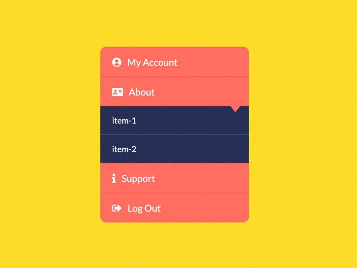
HTML와 CSS를 이용한 아코디언 메뉴입니다.
클릭 시 메뉴가 펼쳐집니다.
HTML 구조
<div class="wrapper">
<ui class="mainMenu">
<li class="item" id="account">
<a href="#account" class="btn"><i class="fas fa-user-circle"></i>My Account</a>
<div class="subMenu">
<a href="">item-1</a>
<a href="">item-2</a>
<a href="">item-3</a>
</div>
</li>
<li class="item" id="about">
<a href="#about" class="btn"><i class="fas fa-address-card"></i>About</a>
<div class="subMenu">
<a href="">item-1</a>
<a href="">item-2</a>
</div>
</li>
<li class="item" id="support">
<a href="#support" class="btn"><i class="fas fa-info"></i>Support</a>
<div class="subMenu">
<a href="">item-1</a>
</div>
</li>
<li class="item">
<a href="#" class="btn"><i class="fas fa-sign-out-alt"></i>Log Out</a>
</li>
</ui>
</div>
<footer>
<p>
Created with <i class="fa fa-heart"></i> by
Follow me :
</p>
</footer>
<div class="youtubeBtn">
<span>Watch on YouTube</span>
<i class="fab fa-youtube"></i>
</a>
</div>
CSS 소스
*{
margin: 0;
padding: 0;
font-family: 'lato';
list-style: none;
text-decoration: none;
}
body{
background-color: #fcdc29;
}
.wrapper{
position: absolute;
top: 50%;
left: 50%;
transform: translate(-50%, -50%);
}
.mainMenu{
width: 250px;
display: block;
border-radius: 10px;
overflow: hidden;
}
.item{
border-top: 1px solid #ef584a;
overflow: hidden;
}
.btn{
display: block;
padding: 15px 20px;
background-color: #ff6f61;
color: #fff;
position: relative;
}
.btn:before{
content: '';
position: absolute;
width: 0;
height: 0;
border-left: 8px solid transparent;
border-right:8px solid transparent;
border-top:10px solid #ff6f61;
right: 15px;
bottom: -10px;
z-index: 9;
}
.btn i {
margin-right: 10px;
}
.subMenu{
background: #273057;
overflow: hidden;
transition: max-height 0.7s;
max-height: 0;
}
.subMenu a{
display: block;
padding: 15px 20px;
color: #fff;
font-size: 14px;
border-bottom: 1px solid #394c7f;
position: relative;
}
.subMenu a:before{
content: '';
opacity: 0;
transition: opacity 0.3s;
}
.subMenu a:hover:before{
content: '';
position: absolute;
height: 0;
width: 6px;
left: 0;
top:0;
opacity: 1;
/* background-color: #d8d824; */
border-top: 24px solid transparent;
border-left: 11px solid #fcdc29;
border-bottom: 24px solid transparent;
}
.subMenu a:after{
content: '';
opacity: 0;
transition: opacity 0.3s;
}
.subMenu a:hover:after{
content: '';
position: absolute;
height: 0;
width: 6px;
right: 0px;
top:0;
opacity: 1;
/* background-color: #d8d824; */
border-top: 24px solid transparent;
border-right: 11px solid #fcdc29;
border-bottom: 24px solid transparent;
}
.subMenu a:hover{
background: #273057;
background: -moz-linear-gradient(top, #273057 0%, #273057 50%, #394c7f 51%, #394c7f 100%);
background: -webkit-linear-gradient(top, #273057 0%,#273057 50%,#394c7f 51%,#394c7f 100%);
background: linear-gradient(to bottom, #273057 0%,#273057 50%,#394c7f 51%,#394c7f 100%);
filter: progid:DXImageTransform.Microsoft.gradient( startColorstr='#273057', endColorstr='#394c7f',GradientType=0 );
transition: all 0.3s;
border-bottom: 1px solid #394c7f;
}
.subMenu a:last-child{
border:none;
}
.item:target .subMenu{
max-height: 10em;
}
/* footer */
footer {
background-color: #222;
color: #fff;
font-size: 14px;
bottom: 0;
position: fixed;
left: 0;
right: 0;
text-align: center;
z-index: 999;
}
footer p {
margin: 10px 0;
font-family: 'Lucida Sans', 'Lucida Sans Regular', 'Lucida Grande', 'Lucida Sans Unicode', Geneva, Verdana, sans-serif;
}
footer .fa-heart{
color: red;
}
footer .fa-dev{
color: #fff;
}
footer .fa-twitter-square{
color:#1da0f1;
}
footer .fa-instagram{
color: #f0007c;
}
fotter .fa-linkedin{
color:#0073b1;
}
footer .fa-codepen{
color:#fff
}
footer a {
color: #3c97bf;
text-decoration: none;
margin-right:5px;
}
.youtubeBtn{
position: fixed;
left: 50%;
transform:translatex(-50%);
bottom: 45px;
cursor: pointer;
transition: all .3s;
vertical-align: middle;
text-align: center;
display: inline-block;
}
.youtubeBtn i{
font-size:20px;
float:left;
}
.youtubeBtn a{
color:#ff0000;
animation: youtubeAnim 1000ms linear infinite;
float:right;
}
.youtubeBtn a:hover{
color:#c9110f;
transition:all .3s ease-in-out;
text-shadow: none;
}
.youtubeBtn i:active{
transform:scale(.9);
transition:all .3s ease-in-out;
}
.youtubeBtn span{
font-family: 'Lato';
font-weight: bold;
color: #000;
display: block;
font-size: 12px;
float: right;
line-height: 20px;
padding-left: 5px;
}
@keyframes youtubeAnim{
0%,100%{
color:#c9110f;
}
50%{
color:#ff0000;
}
}
/* footer */
첨부파일을 다운로드하거나 해당 사이트로 이동하여 전체 소스를 확인하실 수 있습니다.

'웹프로그램밍 자료실 > 기타 자료' 카테고리의 다른 글
| [해피CGI][cgimall] Bad ASN List 악성 ASN 차단 리스트 (0) | 2026.06.11 |
|---|---|
| [해피CGI][cgimall] 반응형이 지원되는 이미지 슬라이드 Responsive Image Slider (0) | 2026.06.10 |
| [해피CGI][cgimall] Direction-Aware Hover with Modern CSS (0) | 2026.06.05 |
| [해피CGI][cgimall] Chunky 3D Buttons (0) | 2026.06.04 |
| [해피CGI][cgimall] 다양한 박물관, 미술관, 공연, 문화재 정보를 조회할 수 있는 오픈 API (0) | 2026.05.28 |


