

| 일 | 월 | 화 | 수 | 목 | 금 | 토 |
|---|---|---|---|---|---|---|
| 1 | 2 | 3 | 4 | |||
| 5 | 6 | 7 | 8 | 9 | 10 | 11 |
| 12 | 13 | 14 | 15 | 16 | 17 | 18 |
| 19 | 20 | 21 | 22 | 23 | 24 | 25 |
| 26 | 27 | 28 | 29 | 30 | 31 |
- #cgimall
- #happycgi
- #쇼핑몰
- #홈페이지제작
- #jQuery
- CGIMALL
- 해피씨지아이
- #CSS
- #해피CGI
- 솔루션
- javascript
- php
- #솔루션
- #image
- 이미지
- jquery
- #웹솔루션
- 홈페이지제작
- 홈페이지
- #홈페이지
- #뉴스
- #이미지
- 사이트제작
- #업종별
- happycgi
- 게시판
- 해피CGI
- #동영상
- CSS
- 웹솔루션
- Today
- Total
웹솔루션개발 26년 노하우! 해피CGI의 모든것
[해피CGI][cgimall] :has()로 만드는 커스텀 커서 인터랙션 데모 본문
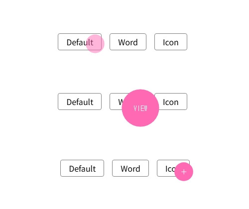
화면에 **커서 전용 DOM(.cursor)**을 띄워두고, 마우스 위치를 CSS 변수 --mx, --my로 전달해 커서가 따라오도록 구성한 예제입니다.
링크/버튼에 마우스를 올리면 body:has(...) 선택자로 상태를 감지해 커서 크기·표시 텍스트(예: “View”)·아이콘 표시가 자동 전환됩니다.
사용 방법은 간단합니다. 페이지에 .cursor 마크업을 포함하고, 커서 상태를 바꾸고 싶은 요소에 cursor-read, cursor-icon 같은 클래스를 붙이면 됩니다.
또한 JS는 mousemove 이벤트로 좌표를 받고, 약간의 지연(부드러운 추적)을 적용해 --mx/--my를 갱신합니다.
참고로 :has()는 브라우저 지원 범위가 있으니(구형 환경) 운영 적용 전 호환성 체크를 권장합니다.
HTML 구조
<div class="demo">
<div class="demo__elements">
<a href="#!" class="demo__button">Default</a>
<a href="#!" class="demo__button cursor-read">Word</a>
<button href="#!" class="demo__button cursor-icon">Icon</button>
</div>
</div>
<div class="cursor">
<div class="cursor__pointer cursor__pointer--default"></div>
<div class="cursor__pointer cursor__pointer--action cursor__pointer--read">
View
</div>
<div class="cursor__pointer cursor__pointer--action cursor__pointer--icon">
<svg
class="icon icon-plus cursor__icon"
xmlns="http://www.w3.org/2000/svg"
xmlns:xlink="http://www.w3.org/1999/xlink"
width="20"
height="20"
viewBox="0 0 20 20"
>
<g id="Group_1" data-name="Group 1" transform="translate(-0.75 -0.75)">
<line
id="Line_1"
data-name="Line 1"
class="icon-plus-line"
y2="10"
transform="translate(10.75 5.75)"></line>
<line
id="Line_2"
data-name="Line 2"
class="icon-plus-line"
y2="10"
transform="translate(15.75 10.75) rotate(90)"></line>
</g>
</svg>
</div>
</div>
CSS 소스
body {
padding: 1rem;
font-family: sans-serif;
display: grid;
place-items: center;
min-height: 100vh;
}
a,
button {
display: inline-block;
border: 1px solid gray;
padding: .5rem 1rem;
border-radius: 4px;
text-decoration: none;
margin: 0;
width: auto;
overflow: visible;
background: transparent;
color: inherit;
font: inherit;
line-height: inherit;
-webkit-font-smoothing: inherit;
-moz-osx-font-smoothing: inherit;
-webkit-appearance: none;
}
.demo__elements {
display: flex;
gap: 1rem
}
.cursor {
--cursor-diameter: 75px;
margin-top: 0;
position: fixed;
top: 0;
left: 0;
translate: calc(var(--mx) - var(--cursor-diameter) / 2)
calc(var(--my) - var(--cursor-diameter) / 2);
width: var(--cursor-diameter);
aspect-ratio: 1/1;
pointer-events: none;
display: grid;
z-index: 1000;
opacity: 0;
scale: 0;
transition: opacity 0.25s ease;
}
:root:hover .cursor {
opacity: 1;
scale: 1;
}
.cursor__pointer {
grid-row: 1;
grid-column: 1;
position: relative;
width: var(--cursor-diameter);
height: var(--cursor-diameter);
transform-origin: 50% 50%;
border-radius: 50%;
background: hotpink;
transition: 0.25s ease;
scale: 0.2;
/* opacity: 0.5; */
color: white;
}
.cursor__pointer--action {
opacity: 0;
display: flex;
align-items: center;
justify-content: center;
font-size: 14px;
font-family: monospace;
text-transform: uppercase;
}
.cursor__pointer--icon {
stroke: currentColor;
}
.cursor__icon {
scale: 2;
}
.cursor__pointer--default {
opacity: 0.5;
}
body:has(:is(a:hover, button:hover)) .cursor__pointer {
scale: 0.5;
}
body:has(:is(a:hover, button:hover)) .cursor__pointer--default {
opacity: 0.5;
}
body:has(.cursor-read:hover) .cursor__pointer {
scale: 1;
}
body:has(.cursor-read:active) .cursor__pointer {
scale: 0.9;
}
body:has(.cursor-read:hover) .cursor__pointer--read {
opacity: 1;
}
body:has(.cursor-icon:hover) .cursor__pointer {
scale: 0.5;
}
body:has(.cursor-icon:active) .cursor__pointer {
scale: 0.4;
}
body:has(.cursor-icon:hover) .cursor__pointer--icon {
opacity: 1;
}
body:has(:is(a:active, button:active)) .cursor__pointer--default {
scale: 0.4;
}
JS 소스
const delay = 5;
let posX = 0,
posY = 0,
mouseX = 0,
mouseY = 0;
const mouseDelay = () => {
posX += (mouseX - posX) / delay;
posY += (mouseY - posY) / delay;
document.documentElement.style.setProperty("--mx", posX + "px");
document.documentElement.style.setProperty("--my", posY + "px");
requestAnimationFrame(mouseDelay);
};
mouseDelay();
document.addEventListener("mousemove", (e) => {
mouseX = e.clientX;
mouseY = e.clientY;
});

'웹프로그램밍 자료실 > 기타 자료' 카테고리의 다른 글
| [해피CGI][cgimall] Microsoft Azure AI 서비스의 개발자용 인터페이스 - Azure Translator API (0) | 2026.02.23 |
|---|---|
| [해피CGI][cgimall] DeepL 번역 서비스의 개발자용 인터페이스 - DeepL API (0) | 2026.02.20 |
| [해피CGI][cgimall] CSS: Radio Input Stars 라디오박스를 이용한 별점 (0) | 2026.02.06 |
| [해피CGI][cgimall] 육각형(벌집) 그리드 갤러리 CSS 데모 (0) | 2026.02.05 |
| [해피CGI][cgimall] 3D Quantum Neural Network (0) | 2026.01.29 |


