

| 일 | 월 | 화 | 수 | 목 | 금 | 토 |
|---|---|---|---|---|---|---|
| 1 | 2 | 3 | 4 | |||
| 5 | 6 | 7 | 8 | 9 | 10 | 11 |
| 12 | 13 | 14 | 15 | 16 | 17 | 18 |
| 19 | 20 | 21 | 22 | 23 | 24 | 25 |
| 26 | 27 | 28 | 29 | 30 | 31 |
Tags
- 해피씨지아이
- #jQuery
- #뉴스
- #happycgi
- CSS
- #업종별
- 홈페이지
- #홈페이지제작
- #image
- 사이트제작
- jquery
- 홈페이지제작
- 웹솔루션
- #솔루션
- php
- happycgi
- #쇼핑몰
- 게시판
- 이미지
- #홈페이지
- 솔루션
- #이미지
- 해피CGI
- #동영상
- #웹솔루션
- CGIMALL
- #CSS
- javascript
- #cgimall
- #해피CGI
- Today
- Total
웹솔루션개발 26년 노하우! 해피CGI의 모든것
[해피CGI][cgimall] Death Stranding inspired menu 본문
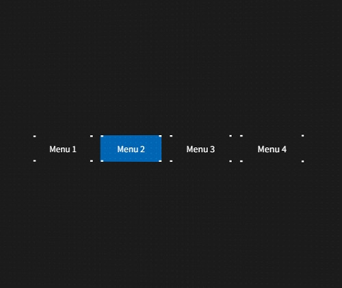
Death Stranding 게임의 메뉴 디자인에 영감을 받아 제작된 메뉴 디자인 입니다.
마우스 오버시 메뉴에 애니메이션 배경이 출력됩니다.
자세한 내용은 데모를 확인해 주시기 바랍니다.
HTML
|
<main>
<nav>
<a href="#">
<span class="content">Menu 1</span>
<span class="l"></span>
<span class="r"></span>
</a>
<a href="#">
<span class="content">Menu 2</span>
<span class="l"></span>
<span class="r"></span>
</a>
<a href="#">
<span class="content">Menu 3</span>
<span class="l"></span>
<span class="r"></span>
</a>
<a href="#">
<span class="content">Menu 4</span>
<span class="l"></span>
<span class="r"></span>
</a>
</nav>
<div class="overlay"></div>
</main>
|
CSS
main {
display: grid;
place-items: center;
height: 100svh;
perspective: 90vw;
background: #1b1b1b;
}
.overlay {
position: absolute;
inset: 0;
background: radial-gradient(circle, #fff 1px, #fff0 1px) 10px 10px/ 10px
10px;
transform: rotateY(-12deg);
pointer-events: none;
opacity: 0.18;
mix-blend-mode: overlay;
}
nav {
display: flex;
gap: 1rem;
padding: 1rem 2rem;
transform: rotateY(-12deg);
a {
--w: 3px;
position: relative;
display: grid;
grid-template-columns: repeat(2, 1fr);
grid-template-rows: auto;
text-decoration: none;
color: #fff;
&:before {
content: "";
display: block;
position: absolute;
inset: 0 -50%;
background: #014d89;
pointer-events: none;
opacity: 0;
}
span {
grid-row: 1;
}
span.l {
grid-column: 1 / 1;
z-index: 1;
}
span.r {
grid-column: 2 / 2;
z-index: 1;
}
span:where(.l, .r) {
&:hover {
grid-column: -1 / 1;
z-index: 2;
}
}
span.content {
display: block;
padding: 1em 2em;
grid-column: -1 / 1;
z-index: 1;
}
&:after {
content: "";
display: block;
grid-column: -1 / 1;
grid-row: 1;
inset: 0;
z-index: 0;
background: linear-gradient(
#fff var(--w),
#fff0 var(--w),
#fff0 calc(100% - var(--w)),
#fff calc(100% - var(--w))
)
calc(var(--w) * -1) 0 / calc(var(--w) * 2.5) no-repeat,
linear-gradient(
#fff var(--w),
#fff0 var(--w),
#fff0 calc(100% - var(--w)),
#fff calc(100% - var(--w))
)
calc(var(--w) + 100%) 0 / calc(var(--w) * 2.5) no-repeat;
}
&:has(span.l:hover):before {
animation: enter-hover-left 160ms forwards steps(2),
blink 1200ms ease-in 114ms infinite;
}
&:has(span.r:hover):before {
animation: enter-hover-right 160ms forwards steps(2),
blink 1200ms ease-in 114ms infinite;
}
}
}
@keyframes enter-hover-left {
from {
opacity: 0.5;
clip-path: polygon(0 0, 25% 0, 25% 100%, 0 100%);
}
25% {
clip-path: polygon(0 0, 75% 0, 25% 100%, 0 100%);
}
50% {
clip-path: polygon(0 0, 75% 0, 75% 100%, 0 100%);
}
75% {
clip-path: polygon(0 0, 75% 0, 75% 100%, 25% 100%);
}
to {
opacity: 1;
clip-path: polygon(25% 0, 75% 0, 75% 100%, 25% 100%);
}
}
@keyframes enter-hover-right {
from {
opacity: 0.5;
clip-path: polygon(75% 0, 100% 0, 100% 100%, 75% 100%);
}
25% {
clip-path: polygon(25% 0, 100% 0, 100% 100%, 75% 100%);
}
50% {
clip-path: polygon(25% 0, 75% 0, 100% 100%, 75% 100%);
}
75% {
clip-path: polygon(25% 0, 75% 0, 75% 100%, 75% 100%);
}
to {
opacity: 1;
clip-path: polygon(25% 0, 75% 0, 75% 100%, 25% 100%);
}
}
@keyframes blink {
from {
filter: brightness(1.5);
}
80%,
to {
filter: brightness(1);
}
}
|

'웹프로그램밍 자료실 > HTML 자료' 카테고리의 다른 글
| [해피CGI][cgimall] Flexbox Cheatsheet (플렉스박스 치트시트) (0) | 2025.07.18 |
|---|---|
| [해피CGI][cgimall] CodePen Home CSS Grid Layout 그리드를 이용한 기본적인 레이아웃 소스 (0) | 2025.07.15 |
| [해피CGI][cgimall] Card Carousel -카드 슬라이더 (0) | 2025.06.24 |
| [해피CGI][cgimall] 마우스 오버 버튼 효과 Minimalist Button Hover Effect (0) | 2025.06.20 |
| [해피CGI][cgimall] 마우스 효과가 들어간 네비게이션 커서 이펙트 Navigation Cursor Effect (0) | 2025.06.19 |
'웹프로그램밍 자료실/HTML 자료' Related Articles
more


Comments