

| 일 | 월 | 화 | 수 | 목 | 금 | 토 |
|---|---|---|---|---|---|---|
| 1 | 2 | 3 | 4 | |||
| 5 | 6 | 7 | 8 | 9 | 10 | 11 |
| 12 | 13 | 14 | 15 | 16 | 17 | 18 |
| 19 | 20 | 21 | 22 | 23 | 24 | 25 |
| 26 | 27 | 28 | 29 | 30 | 31 |
- 홈페이지제작
- #cgimall
- #업종별
- #웹솔루션
- 해피CGI
- 이미지
- 해피씨지아이
- #해피CGI
- 게시판
- 홈페이지
- 솔루션
- #happycgi
- #CSS
- CGIMALL
- #동영상
- #쇼핑몰
- #이미지
- jquery
- #홈페이지
- happycgi
- #jQuery
- #솔루션
- #홈페이지제작
- php
- #image
- CSS
- 웹솔루션
- 사이트제작
- #뉴스
- javascript
- Today
- Total
웹솔루션개발 26년 노하우! 해피CGI의 모든것
[해피CGI][cgimall] 투명한 카드와 GSAP 애니메이션 Glass Card w/ SVG + GSAP 본문
[해피CGI][cgimall] 투명한 카드와 GSAP 애니메이션 Glass Card w/ SVG + GSAP
해피CGI윤실장 2025. 7. 30. 09:06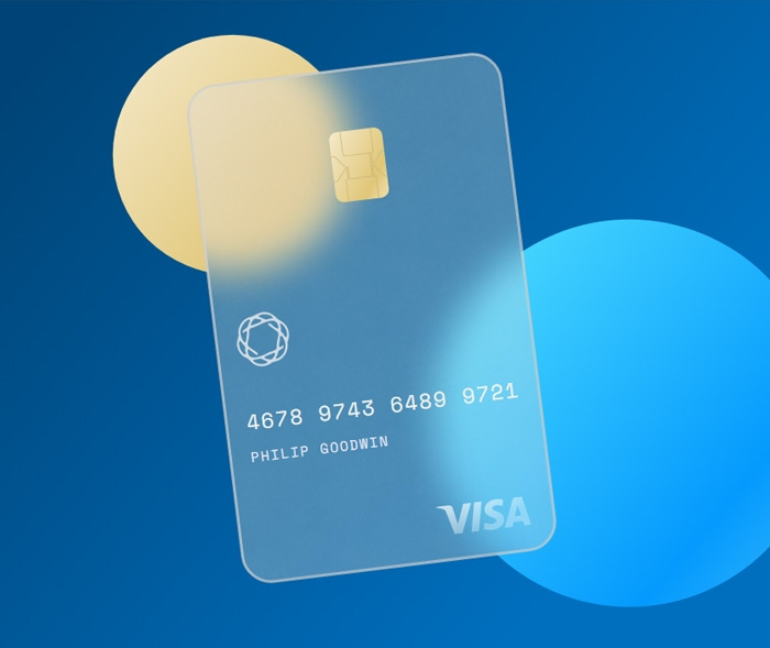
마우스 움직임에 따라 투명한 카드와 백그라운드가 움직이는 애니메이션 효과입니다.
응용하여 다양하게 활용 가능합니다.
HTML 구조
<svg width="100%" height="100%">
<defs>
<linearGradient id="grad1" x1="0%" y1="0%" x2="100%" y2="65%">
<stop offset="10%" stop-color="#004476" />
<stop offset="90%" stop-color="#006fbe" />
</linearGradient>
<linearGradient id="grad2" x1="0%" y1="0%" x2="100%" y2="85%">
<stop offset="0%" stop-color="#f5eacc" />
<stop offset="80%" stop-color="#e0c677" />
<stop offset="110%" stop-color="#ebd8a0" />
</linearGradient>
<linearGradient id="grad3" x1="0%" y1="0%" x2="100%" y2="85%">
<stop offset="0%" stop-color="#54e2fe" />
<stop offset="80%" stop-color="#049afd" />
<stop offset="110%" stop-color="#2aaffc" />
</linearGradient>
<linearGradient id="grad4" x1="0%" y1="0%" x2="80%" y2="70%">
<stop offset="0%" stop-color="rgba(255,255,255,0.75)" />
<stop offset="90%" stop-color="rgba(255,255,255,0.3)" />
</linearGradient>
<pattern id="cardBg" x="0" y="0" width="100" height="100" patternUnits="userSpaceOnUse">
<image opacity="0.5" width="100" height="100" xlink:href="https://assets.codepen.io/721952/whiteNoise2.png" />
<image class="fillLight" opacity="0.5" width="100" height="100" xlink:href="https://assets.codepen.io/721952/whiteNoise.png" />
</pattern>
<mask id="m">
<rect class="card" fill="#fff" width="340" height="540" rx="30" ry="30" />
</mask>
</defs>
.
.
.
</svg>
CSS 소스
@import url('https://fonts.googleapis.com/css2?family=Space+Mono&display=swap');
html, body {
width:100%;
height:100%;
overflow:hidden;
font-family: 'Space Mono', monospace;
letter-spacing:1.6px;
}
JS 소스
gsap.timeline()
.set('.logo', { x:215, y:482 })
.set('.chip', { x:148, y:66 })
.set('.knot', { x:22, y:250 })
.set('.numTxt', { x:22, y:375 })
.set('.nameTxt', { x:22, y:410 })
.add(centerMain(), 0.2)
.from('.ball', { duration:2,
transformOrigin:'50% 50%',
scale:0,
opacity:0,
ease:'elastic',
stagger:0.2
}, 0)
.fromTo('.card', { x:200,
y:40,
transformOrigin:'50% 50%',
rotation:-4,
skewX:10,
skewY:4,
scale:2,
opacity:0
},{
duration:1.3,
skewX:0,
skewY:0,
scale:1,
opacity:1,
ease:'power4.inOut'
}, 0.2)
.
.
.
해당 사이트로 이동해서 전체 소스를 확인하실 수 있습니다.

'웹프로그램밍 자료실 > HTML 자료' 카테고리의 다른 글
| [해피CGI][cgimall] Bubbles Background Animation (0) | 2025.08.13 |
|---|---|
| [해피CGI][cgimall] 3D느낌의 이미지 슬라이드 Voyage Slider (0) | 2025.07.31 |
| [해피CGI][cgimall] Space Facts Card Carousel (0) | 2025.07.25 |
| [해피CGI][cgimall] Flexbox Cheatsheet (플렉스박스 치트시트) (0) | 2025.07.18 |
| [해피CGI][cgimall] CodePen Home CSS Grid Layout 그리드를 이용한 기본적인 레이아웃 소스 (0) | 2025.07.15 |


