

| 일 | 월 | 화 | 수 | 목 | 금 | 토 |
|---|---|---|---|---|---|---|
| 1 | 2 | 3 | 4 | |||
| 5 | 6 | 7 | 8 | 9 | 10 | 11 |
| 12 | 13 | 14 | 15 | 16 | 17 | 18 |
| 19 | 20 | 21 | 22 | 23 | 24 | 25 |
| 26 | 27 | 28 | 29 | 30 | 31 |
- #업종별
- php
- #홈페이지제작
- CGIMALL
- 해피씨지아이
- 웹솔루션
- 홈페이지
- #CSS
- #웹솔루션
- #쇼핑몰
- #해피CGI
- #jQuery
- #홈페이지
- happycgi
- #뉴스
- #image
- CSS
- javascript
- #cgimall
- jquery
- 게시판
- #이미지
- #동영상
- 해피CGI
- #happycgi
- 사이트제작
- 이미지
- #솔루션
- 솔루션
- 홈페이지제작
- Today
- Total
웹솔루션개발 26년 노하우! 해피CGI의 모든것
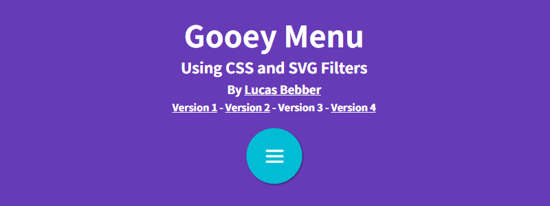
[해피CGI][cgimall] CSS Gooey Menu (Version 3) 본문
**CSS Gooey Menu (Version 3)**는 SVG 필터와 CSS 트랜지션을 조합해 만든 인터랙티브한 원형 메뉴입니다.
버튼 클릭 시 서브 메뉴들이 액체처럼 부드럽게 퍼지고 합쳐지는 **'Gooey 효과'**가 특징이며, 시각적으로 독특하면서도 부드러운 사용자 경험을 제공합니다.
SVG 필터 기반이라 가볍고 해상도에 독립적이며, JavaScript 없이 순수 CSS로도 구현이 가능합니다.

HTML 구조
<h1>Gooey Menu</h1>
<h2>Using CSS and SVG Filters</h2>
By Lucas Bebber
Version 1 - Version 2 - Version 3 - Version 4
<link rel="stylesheet" href="//maxcdn.bootstrapcdn.com/font-awesome/4.3.0/css/font-awesome.min.css">
<nav class="menu">
<input type="checkbox" href="#" class="menu-open" name="menu-open" id="menu-open"/>
<label class="menu-open-button" for="menu-open">
<span class="hamburger hamburger-1"></span>
<span class="hamburger hamburger-2"></span>
<span class="hamburger hamburger-3"></span>
</label>
<a href="#" class="menu-item"> <i class="fa fa-bar-chart"></i> </a>
<a href="#" class="menu-item"> <i class="fa fa-plus"></i> </a>
<a href="#" class="menu-item"> <i class="fa fa-heart"></i> </a>
<a href="#" class="menu-item"> <i class="fa fa-envelope"></i> </a>
</nav>
<!-- filters -->
<defs>
<filter id="shadowed-goo">
<feGaussianBlur in="SourceGraphic" result="blur" stdDeviation="10" />
<feColorMatrix in="blur" mode="matrix" values="1 0 0 0 0 0 1 0 0 0 0 0 1 0 0 0 0 0 18 -7" result="goo" />
<feGaussianBlur in="goo" stdDeviation="3" result="shadow" />
<feColorMatrix in="shadow" mode="matrix" values="0 0 0 0 0 0 0 0 0 0 0 0 0 0 0 0 0 0 1 -0.2" result="shadow" />
<feOffset in="shadow" dx="1" dy="1" result="shadow" />
<feComposite in2="shadow" in="goo" result="goo" />
<feComposite in2="goo" in="SourceGraphic" result="mix" />
</filter>
<filter id="goo">
<feGaussianBlur in="SourceGraphic" result="blur" stdDeviation="10" />
<feColorMatrix in="blur" mode="matrix" values="1 0 0 0 0 0 1 0 0 0 0 0 1 0 0 0 0 0 18 -7" result="goo" />
<feComposite in2="goo" in="SourceGraphic" result="mix" />
</filter>
</defs>
</svg>
CSS 소스
@import "compass/css3";
//vars
$fg:#00bcd4;
$bg:#673ab7;
$pi:3.14;
//config
$menu-items:4;
$open-distance:105px;
$opening-angle:$pi*2;
body{
background:$bg;
color:white;
text-align:center;
}
a{
color:inherit;
}
h1, h2, h3, h4{
margin:0;
margin-bottom:10px;
margin-top:10px;
}
h1{
font-size:3em;
}
%goo{
filter:url('#shadowed-goo');
// debug
//background:rgba(255,0,0,0.2);
}
%ball{
background:$fg;
border-radius:100%;
width:80px;
height:80px;
margin-left:-40px;
position:absolute;
top:20px;
color:white;
text-align:center;
line-height:80px;
transform:translate3d(0,0,0);
transition:transform ease-out 200ms;
}
.menu-open{
display:none;
}
.menu-item{
@extend %ball;
}
.hamburger{
$width:25px;
$height:3px;
width:$width;
height:$height;
background:white;
display:block;
position:absolute;
top:50%;
left:50%;
margin-left:-$width/2;
margin-top:-$height/2;
transition:transform 200ms;
}
$hamburger-spacing:8px;
.hamburger-1{
transform:translate3d(0,-$hamburger-spacing,0);
}
.hamburger-2{
transform:translate3d(0,0,0);
}
.hamburger-3{
transform:translate3d(0,$hamburger-spacing,0);
}
.menu-open:checked+.menu-open-button{
.hamburger-1{
transform:translate3d(0,0,0) rotate(45deg);
}
.hamburger-2{
transform:translate3d(0,0,0) scale(0.1,1);
}
.hamburger-3{
transform:translate3d(0,0,0) rotate(-45deg);
}
}
.menu{
@extend %goo;
$width:650px;
$height:150px;
position:absolute;
left:50%;
margin-left:-80px;
padding-top:20px;
padding-left:80px;
width:$width;
height:$height;
box-sizing:border-box;
font-size:20px;
text-align:left;
}
.menu-item{
&:hover{
background:white;
color:$fg;
}
@for $i from 1 through $menu-items{
&:nth-child(#{$i+2}){
transition-duration:180ms;
}
}
}
.menu-open-button{
@extend %ball;
z-index:2;
transition-timing-function:cubic-bezier(0.175, 0.885, 0.320, 1.275);
transition-duration:400ms;
transform:scale(1.1,1.1) translate3d(0,0,0);
cursor:pointer;
}
.menu-open-button:hover{
transform:scale(1.2,1.2) translate3d(0,0,0);
}
.menu-open:checked+.menu-open-button{
transition-timing-function:linear;
transition-duration:200ms;
transform:scale(0.8,0.8) translate3d(0,0,0);
}
.menu-open:checked~.menu-item{
transition-timing-function:cubic-bezier(0.165, 0.840, 0.440, 1.000);
@for $i from 1 through $menu-items{
&:nth-child(#{$i+2}){
transition-duration:90ms+(100ms*$i);
transform:translate3d(110px*$i,0,0);
}
}
}

'웹프로그램밍 자료실 > HTML 자료' 카테고리의 다른 글
| [해피CGI][cgimall] 마우스 오버 버튼 효과 Minimalist Button Hover Effect (0) | 2025.06.20 |
|---|---|
| [해피CGI][cgimall] 마우스 효과가 들어간 네비게이션 커서 이펙트 Navigation Cursor Effect (0) | 2025.06.19 |
| [해피CGI][cgimall] Pure SVG Loader Animation -SVG 동적 로딩 애니메이션 (0) | 2025.05.20 |
| [해피CGI][cgimall] LetterMorph (0) | 2025.05.15 |
| [해피CGI][cgimall] Squircle Web Component Button (0) | 2025.05.14 |


