

| 일 | 월 | 화 | 수 | 목 | 금 | 토 |
|---|---|---|---|---|---|---|
| 1 | 2 | 3 | ||||
| 4 | 5 | 6 | 7 | 8 | 9 | 10 |
| 11 | 12 | 13 | 14 | 15 | 16 | 17 |
| 18 | 19 | 20 | 21 | 22 | 23 | 24 |
| 25 | 26 | 27 | 28 | 29 | 30 | 31 |
Tags
- CSS
- #이미지
- 홈페이지제작
- #jQuery
- #뉴스
- #홈페이지제작
- 해피CGI
- javascript
- 이미지
- 사이트제작
- 솔루션
- #업종별
- 홈페이지
- happycgi
- #CSS
- #해피CGI
- CGIMALL
- jquery
- #happycgi
- #cgimall
- #동영상
- php
- #쇼핑몰
- #솔루션
- 웹솔루션
- #홈페이지
- 게시판
- #웹솔루션
- 해피씨지아이
- #image
- Today
- Total
웹솔루션개발 25년 노하우! 해피CGI의 모든것
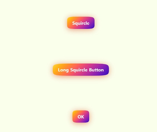
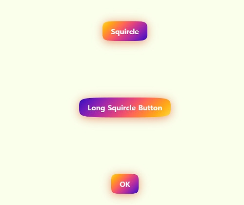
[해피CGI][cgimall] Squircle Web Component Button 본문
버튼 디자인으로 마우스 오버 시 버튼 배경이 바뀌는 애니메이션이 있습니다.
HTML, CSS, JS로 제작되었습니다.
자세한 내용은 데모를 확인해 주시기 바랍니다.
HTML
|
<sq-button onclick="alert('Yay!')">
Squircle
</sq-button>
<sq-button onclick="alert('The long and the short of it')">
Long Squircle Button
</sq-button>
<sq-button onclick="alert('Saved!')">
OK
</sq-button>
|
CSS
|
body {
height: 100svh;
display: grid;
place-items: center;
background: #faffec;
}
@property --bg-rotate {
syntax: '<angle>';
initial-value: 0deg;
inherits: false;
}
|
JS
|
// technique pulled from:
customElements.define("sq-button", class extends HTMLElement {
constructor() {
super()
this.attachShadow({ mode: "open" })
}
connectedCallback() {
const styles = `
:host {
--drop-shadow: 0 4px 15px rgb(220, 80, 40, 0.6);
--animation-duration: 0.2s;
--bg-gradient: #fc3 5%, #41b 95%;
display: inline-block;
filter: drop-shadow(var(--drop-shadow));
transition: all var(--animation-duration) ease-in-out;
}
/* This effect is cool, but unfortunately has graphical glitches in Safari */
/* :host(:hover) {
scale: 105%;
rotate: -1deg;
} */
svg {
position: absolute;
height: 0px;
width: 0px;
margin-left: -999px;
}
button {
--bg-rotate: 135deg;
-webkit-tap-highlight-color: rgba(0, 0, 0, 0);
appearance: none;
font-size: 1.5rem;
font-family: system-ui;
font-weight: bold;
border: 0;
margin: 0;
padding: .85em 1.15em;
line-height: 1;
color: white;
clip-path: url(#squircleClip);
background-image: linear-gradient(var(--bg-rotate) in oklch, var(--bg-gradient));
transition: --bg-rotate var(--animation-duration) ease-in-out;
}
button:hover {
--bg-rotate: 315deg;
}
`
this.shadowRoot.innerHTML = `
<style>${styles}</style>
<button><slot></slot></button>
<svg>
<clipPath id="squircleClip" clipPathUnits="objectBoundingBox">
<path d="M 0,0.5
C 0,0 0,0 0.5,0
1,0 1,0 1,0.5
1,1 1,1 0.5,1
0,1 0,1 0,0.5"
/>
</clipPath>
</svg>
`
// more rounded d: M 0 0.5 C 0 0.1 0 0 0.5 0 S 1 0.1 1 0.5 S 1 1 0.5 1 S 0 0.9 0 0.5
}
})
|

'웹프로그램밍 자료실 > HTML 자료' 카테고리의 다른 글
| [해피CGI][cgimall] Pure SVG Loader Animation -SVG 동적 로딩 애니메이션 (0) | 2025.05.20 |
|---|---|
| [해피CGI][cgimall] LetterMorph (0) | 2025.05.15 |
| [해피CGI][cgimall] 클릭하면 서서히 나오는 오버레이 메뉴 기본형 overlay menu (0) | 2025.05.13 |
| [해피CGI][cgimall] 평점이 나오는 마우스 오버 효과 Movie Poster Interaction (0) | 2025.05.12 |
| [해피CGI][cgimall] Bootstrap Button Toggle (On/Off Switch) 스위치 버튼 (0) | 2025.05.09 |
'웹프로그램밍 자료실/HTML 자료' Related Articles
more


Comments