

| 일 | 월 | 화 | 수 | 목 | 금 | 토 |
|---|---|---|---|---|---|---|
| 1 | ||||||
| 2 | 3 | 4 | 5 | 6 | 7 | 8 |
| 9 | 10 | 11 | 12 | 13 | 14 | 15 |
| 16 | 17 | 18 | 19 | 20 | 21 | 22 |
| 23 | 24 | 25 | 26 | 27 | 28 | 29 |
| 30 | 31 |
- php
- 홈페이지제작
- 해피CGI
- #해피CGI
- happycgi
- jquery
- #cgimall
- 웹솔루션
- #웹솔루션
- CGIMALL
- #홈페이지
- 솔루션
- #happycgi
- #솔루션
- #홈페이지제작
- #업종별
- #image
- #뉴스
- 사이트제작
- 홈페이지
- #쇼핑몰
- 해피씨지아이
- CSS
- javascript
- 쇼핑몰
- #이미지
- 게시판
- #jQuery
- #동영상
- #CSS
- Today
- Total
웹솔루션개발 25년 노하우! 해피CGI의 모든것
[해피CGI][cgimall] CSS 3D Flip Box-CSS를 활용한 3D flip 박스 본문
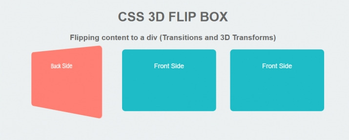
CSS를 활용한 3D flip 박스입니다.
- CSS 3D 플립 박스. div로 콘텐츠 뒤집기 ( 전환 및 3D 변형 ). 앞면. 뒷면. 앞면. 뒷면. 앞면. 뒷면.
HTML 구조
<h1>CSS 3D FLIP BOX</h1>
<h3>Flipping content to a div (Transitions and 3D Transforms)</h3>
<div class="wrapper">
<div class="col_third">
<div class="hover panel">
<div class="front">
<div class="box1">
<p>Front Side</p>
</div>
</div>
<div class="back">
<div class="box2">
<p>Back Side</p>
</div>
</div>
</div>
</div>
<div class="col_third">
<div class="hover panel">
<div class="front">
<div class="box1">
<p>Front Side</p>
</div>
</div>
<div class="back">
<div class="box2">
<p>Back Side</p>
</div>
</div>
</div>
</div>
<div class="col_third end">
<div class="hover panel">
<div class="front">
<div class="box1">
<p>Front Side</p>
</div>
</div>
<div class="back">
<div class="box2">
<p>Back Side</p>
</div>
</div>
</div>
</div>
</div>
CSS 소스
body {
background-color: #ecf0f1;
margin: 20px;
font-family: Arial, Tahoma;
font-size: 20px;
color: #666666;
text-align: center;
}
p { color: #ffffff; }
/*-=-=-=-=-=-=-=-=-=-*/
/* Column Grids */
/*-=-=-=-=-=-=-=-=-= */
.col_half { width: 49%; }
.col_third { width: 32%; }
.col_fourth { width: 23.5%; }
.col_fifth { width: 18.4%; }
.col_sixth { width: 15%; }
.col_three_fourth { width: 74.5%;}
.col_twothird{ width: 66%;}
.col_half,
.col_third,
.col_twothird,
.col_fourth,
.col_three_fourth,
.col_fifth{
position: relative;
display:inline;
display: inline-block;
float: left;
margin-right: 2%;
margin-bottom: 20px;
}
.end { margin-right: 0 !important; }
/*-=-=-=-=-=-=-=-=-=-=- */
/* Flip Panel */
/*-=-=-=-=-=-=-=-=-=-=- */
.wrapper{ width: 980px; margin: 0 auto; background-color: #bdd3de; hoverflow: hidden;}
.panel {
margin: 0 auto;
height: 130px;
position: relative;
-webkit-perspective: 600px;
-moz-perspective: 600px;
}
.panel .front,
.panel .back {
text-align: center;
}
.panel .front {
height: inherit;
position: absolute;
top: 0;
z-index: 900;
text-align: center;
-webkit-transform: rotateX(0deg) rotateY(0deg);
-moz-transform: rotateX(0deg) rotateY(0deg);
-webkit-transform-style: preserve-3d;
-moz-transform-style: preserve-3d;
-webkit-backface-visibility: hidden;
-moz-backface-visibility: hidden;
-webkit-transition: all .4s ease-in-out;
-moz-transition: all .4s ease-in-out;
-ms-transition: all .4s ease-in-out;
-o-transition: all .4s ease-in-out;
transition: all .4s ease-in-out;
}
.panel .back {
height: inherit;
position: absolute;
top: 0;
z-index: 1000;
-webkit-transform: rotateY(-180deg);
-moz-transform: rotateY(-180deg);
-webkit-transform-style: preserve-3d;
-moz-transform-style: preserve-3d;
-webkit-backface-visibility: hidden;
-moz-backface-visibility: hidden;
-webkit-transition: all .4s ease-in-out;
-moz-transition: all .4s ease-in-out;
-ms-transition: all .4s ease-in-out;
-o-transition: all .4s ease-in-out;
transition: all .4s ease-in-out;
}
.panel.flip .front {
z-index: 900;
-webkit-transform: rotateY(180deg);
-moz-transform: rotateY(180deg);
}
.panel.flip .back {
z-index: 1000;
-webkit-transform: rotateX(0deg) rotateY(0deg);
-moz-transform: rotateX(0deg) rotateY(0deg);
}
.box1{
background-color: #14bcc8;
width: 250px;
height: 150px;
margin: 0 auto;
padding: 20px;
border-radius: 10px;
-moz-border-radius: 10px;
-webkit-border-radius: 10px;
}
.box2{
background-color: #ff7e70;
width: 250px;
height: 150px;
margin: 0 auto;
padding: 20px;
border-radius: 10px;
-moz-border-radius: 10px;
-webkit-border-radius: 10px;
}
JS 소스
$(document).ready(function(){
// set up hover panels
// although this can be done without JavaScript, we've attached these events
// because it causes the hover to be triggered when the element is tapped on a touch device
$('.hover').hover(function(){
$(this).addClass('flip');
},function(){
$(this).removeClass('flip');
});
});

'웹프로그램밍 자료실 > HTML 자료' 카테고리의 다른 글
| [해피CGI][cgimall] Animated CSS Gradient Text 텍스트 애니메이션 (0) | 2025.03.05 |
|---|---|
| [해피CGI][cgimall] Live CSS Blur (0) | 2025.02.18 |
| [해피CGI][cgimall] 클릭 버튼 효과 Particle Button (0) | 2025.02.17 |
| [해피CGI][cgimall] PURE CSS SIDEBAR TOGGLE MENU 사이드바 메뉴 (0) | 2024.12.19 |
| [해피CGI][cgimall] 좋아요 버튼 애니메이션 Interactive splat like button (0) | 2024.12.06 |


