[해피CGI][cgimall] CSS만으로 구현한 인터랙티브 3D 카드 효과
마우스 움직임에 따라 카드가 자연스럽게 기울어지며
입체적으로 반응하는 3D 인터랙션 효과를 CSS로 구현한 예제입니다.
transform, perspective, hover 속성을 활용하여
별도의 JavaScript 없이도 카드가 실제로 움직이는 듯한 동적인 UI 효과를 표현할 수 있습니다.
카드형 레이아웃, 서비스 소개 영역, 상품 리스트 등 다양한 UI 디자인에 적용하기 좋으며,
간단한 코드만으로도 세련된 인터랙션을 구현할 수 있는 효과적인 예제입니다.
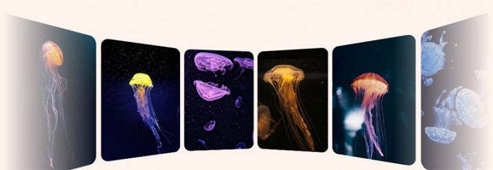
HTML 구조
- const DATA = [
- '1540968221243-29f5d70540bf',
- '1596135187959-562c650d98bc',
- '1628944682084-831f35256163',
- '1590013330451-3946e83e0392',
- '1590421959604-741d0eec0a2e',
- '1572613000712-eadc57acbecd',
- '1570097192570-4b49a6736f9f',
- '1620789550663-2b10e0080354',
- '1617775623669-20bff4ffaa5c',
- '1548600916-dc8492f8e845',
- '1573824969595-a76d4365a2e6',
- '1633936929709-59991b5fdd72'
- ];
- const N = DATA.length;
.scene
.a3d(style=`--n: ${N}`)
- for(let i = 0; i < N; i++)
img.card(src=`https://images.unsplash.com/photo-${DATA[i]}?w=280`
style=`--i: ${i}` alt='jellyfish')
//- generates this kind of HTML:
//- <div class="scene">
//- <div class="a3d" style="--n: 12">
//- <img class="card" src="image0.jpg" style="--i: 0" alt="image description"/>
//- <img class="card" src="image1.jpg" style="--i: 1" alt="image description"/>
//- <!-- the rest of the cards -->
//- </div>
//- </div>
CSS 소스
/* ====== Relevant CSS ====== */
.scene, .a3d { display: grid }
.scene {
/* prevent scrollbars */
overflow: hidden;
/* for 3D look; smaller = more extreme effect */
perspective: 35em;
mask: /* lateral fade */
linear-gradient(90deg,
#0000, red 20% 80%, #0000)
}
.a3d {
place-self: center /* middle align */;
/* don't flatten 3D transformed children
* of this parent having its own 3D transform */
transform-style: preserve-3d;
animation: ry 32s linear infinite
}
/* simplest y axis rotation */
@keyframes ry { to { rotate: y 1turn } }
.card {
/* base card width, you may change this */
--w: 17.5em;
/* compute base angle corresponding to a card */
--ba: 1turn/var(--n); /* in the future: sibling-count() */
grid-area: 1/ 1 /* stack in same one grid cell */;
width: var(--w);
aspect-ratio: 7/ 10;
object-fit: cover;
border-radius: 1.5em;
/* don't want to see back of cards in front of screen plane */
backface-visibility: hidden;
/* need to use a transform chain here, cannot use separate
* rotate & translate properties because they'd be applied
* in wrong order (translate, then rotate) for what we need */
transform:
/* rotate around y axis; in the future: sibling-index() */
rotatey(calc(var(--i)*var(--ba)))
/* only after that translate along z axis with minus */
translatez(calc(-1*(.5*var(--w) + .5em)/tan(.5*var(--ba))))
}
@media (prefers-reduced-motion: reduce) {
.a3d { animation-duration: 128s }
}
/* ====== General page prettifying and layout ====== */
html, body { display: grid }
html { height: 100% }
body { background: #fff3ed }