

| 일 | 월 | 화 | 수 | 목 | 금 | 토 |
|---|---|---|---|---|---|---|
| 1 | ||||||
| 2 | 3 | 4 | 5 | 6 | 7 | 8 |
| 9 | 10 | 11 | 12 | 13 | 14 | 15 |
| 16 | 17 | 18 | 19 | 20 | 21 | 22 |
| 23 | 24 | 25 | 26 | 27 | 28 | 29 |
| 30 | 31 |
- CSS
- 사이트제작
- happycgi
- #홈페이지
- #뉴스
- 웹솔루션
- php
- #CSS
- #cgimall
- CGIMALL
- #솔루션
- #동영상
- #happycgi
- javascript
- #쇼핑몰
- 해피씨지아이
- 게시판
- jquery
- #해피CGI
- #image
- 홈페이지
- 홈페이지제작
- #jQuery
- 이미지
- #업종별
- #웹솔루션
- 솔루션
- 해피CGI
- #홈페이지제작
- #이미지
- Today
- Total
웹솔루션개발 26년 노하우! 해피CGI의 모든것
[해피CGI][cgimall] 반응형 확장 이미지 카드 본문
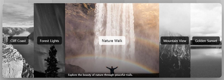
이미지 카드에 마우스를 올렸을 때 해당 카드가 넓게 확장되며 강조되는 반응형 카드 UI 예제입니다.
기본 상태에서는 여러 이미지가 동일한 비율로 나열되고, 선택한 카드에 마우스를 올리면 카드가 자연스럽게 커지면서 이미지가 컬러로 전환되고 확대됩니다.
카드 중앙에는 제목이 표시되며, 마우스 오버 시 설명 문구가 함께 나타나 콘텐츠 정보를 직관적으로 전달할 수 있습니다.
별도의 자바스크립트 없이 HTML과 CSS만으로 구성되어 적용이 비교적 간단하며, 이미지 갤러리, 포트폴리오, 여행지 소개, 상품 이미지, 브랜드 비주얼 영역 등에 활용하기 좋습니다.
HTML 구조
<div class="cards">
<!-- Card 1: Cliff Coast -->
<div class="card">
<a href="https://picsum.photos/id/1015/800/600" target="_blank" rel="noopener noreferrer">
< img src="https://picsum.photos/id/1015/800/600" alt="Mountain landscape with river" loading="lazy" />
<div class="card-title">Cliff Coast</div>
<p class="card-desc">
Rocky shoreline with blue water and a wide sky.
</p>
</a>
</div>
<!-- Card 2: Forest Lights -->
<div class="card">
<a href="https://picsum.photos/id/1022/800/600" target="_blank" rel="noopener noreferrer">
<img src="https://picsum.photos/id/1022/800/600" alt="A vivid display of the aurora borealis." loading="lazy" />
<div class="card-title">Forest Lights</div>
<p class="card-desc">
A vivid display of the aurora borealis.
</p>
</a>
</div>
<!-- Card 3: Nature Walk -->
<div class="card">
<a href="https://picsum.photos/id/1035/800/600" target="_blank" rel="noopener noreferrer">
<img src="https://picsum.photos/id/1035/800/600" alt="Person walking in nature" loading="lazy">
<div class="card-title">Nature Walk</div>
<p class="card-desc">
Explore the beauty of nature through peaceful trails.
</p>
</a>
</div>
<!-- Card 4: Mountain View -->
<div class="card">
<a href="https://picsum.photos/id/1045/800/600" target="_blank" rel="noopener noreferrer">
<img src="https://picsum.photos/id/1045/800/600" alt="City skyline at night" loading="lazy">
<div class="card-title">Mountain View</div>
<p class="card-desc">
Clouds drifting over a peaceful mountain landscape.
</p>
</a>
</div>
<!-- Card 5: Sunset -->
<div class="card">
<a href="https://picsum.photos/id/1055/800/600" target="_blank" rel="noopener noreferrer">
<img src="https://picsum.photos/id/1055/800/600" alt="Beautiful sunset over horizon" loading="lazy" />
<div class="card-title">Golden Sunset</div>
<p class="card-desc">
Witness the golden hour as the sun sets on the horizon.
</p>
</a>
</div>
</div>
</div>
<!-- Footer -->
<footer class="site-footer">
<p class="copyright">
© 2026 <span class="author-name">Fatih YILDIZ</span> ·
fthyldz.com
</a>
</p>
</footer>
CSS 소스
body {
margin: 0;
min-height: 100vh;
display: flex;
align-items: center;
justify-content: center;
background: repeating-linear-gradient(90deg, #0002 0 1px, #0000 0 5vw) -2.5vw 0 /
100% 60%,
linear-gradient(#0002, #0000 30% 70%, #0001) 50% 0% / 100% 60%,
linear-gradient(hsl(0deg 0% 70%) 0 0) 50% 0% / 5vw 60%,
linear-gradient(hsl(0deg 0% 73%) 0 0) 50% 0% / 15vw 60%,
linear-gradient(hsl(0deg 0% 76%) 0 0) 50% 0% / 25vw 60%,
linear-gradient(hsl(0deg 0% 79%) 0 0) 50% 0% / 35vw 60%,
linear-gradient(hsl(0deg 0% 82%) 0 0) 50% 0% / 45vw 60%,
linear-gradient(hsl(0deg 0% 85%) 0 0) 50% 0% / 55vw 60%,
linear-gradient(hsl(0deg 0% 88%) 0 0) 50% 0% / 65vw 60%,
linear-gradient(hsl(0deg 0% 91%) 0 0) 50% 0% / 75vw 60%,
linear-gradient(hsl(0deg 0% 94%) 0 0) 50% 0% / 85vw 60%,
linear-gradient(hsl(0deg 0% 96%) 0 0) 50% 0% / 95vw 60%,
linear-gradient(hsl(0deg 0% 98%) 0 0) 50% 0% / 105vw 60%,
radial-gradient(100vw 50vw, #0002, #0000),
conic-gradient(
from 170.5deg at 50% calc(60% - 14.8vw),
hsl(0deg 0% 70%) 19deg,
#0000 0
)
0 100% / 100vw 100%,
conic-gradient(
from 153deg at 50% calc(60% - 14.8vw),
hsl(0deg 0% 73%) 54deg,
#0000 0
),
conic-gradient(
from 140deg at 50% calc(60% - 14.8vw),
hsl(0deg 0% 76%) 80deg,
#0000 0
),
conic-gradient(
from 130deg at 50% calc(60% - 14.8vw),
hsl(0deg 0% 79%) 100deg,
#0000 0
),
conic-gradient(
from 123deg at 50% calc(60% - 14.8vw),
hsl(0deg 0% 82%) 114deg,
#0000 0
),
conic-gradient(
from 118.5deg at 50% calc(60% - 14.8vw),
hsl(0deg 0% 85%) 123deg,
#0000 0
),
conic-gradient(
from 114.5deg at 50% calc(60% - 14.8vw),
hsl(0deg 0% 88%) 131deg,
#0000 0
),
conic-gradient(
from 111.5deg at 50% calc(60% - 14.8vw),
hsl(0deg 0% 91%) 137deg,
#0000 0
),
conic-gradient(
from 109.2deg at 50% calc(60% - 14.8vw),
hsl(0deg 0% 94%) 141.6deg,
#0000 0
),
conic-gradient(
from 107.3deg at 50% calc(60% - 14.8vw),
hsl(0deg 0% 96%) 145.3deg,
#0000 0
),
hsl(0deg 0% 98%);
background-repeat: no-repeat;
font-family: system-ui, -apple-system, BlinkMacSystemFont, "Segoe UI",
sans-serif;
color: #111;
}
/* CARDS CONTAINER
Flexbox container that holds all cards in a row.
Uses min() for responsive width without media queries.
Elegant shadow creates depth and floating effect.
*/
.cards {
display: flex;
flex-wrap: nowrap;
width: min(1170px, 80vw);
height: 400px;
overflow: hidden;
border-radius: 1rem;
box-shadow: 0 26px 70px rgba(0, 0, 0, 0.45),
0 0 0 1px rgba(255, 255, 255, 0.5);
white-space: nowrap;
z-index: 2;
}
/* INDIVIDUAL CARD
Each card uses flex: 1 1 0 for equal distribution.
min-width: 0 prevents flex items from overflowing.
will-change hints browser for optimized animations.
*/
.card {
flex: 1 1 0;
min-width: 0;
height: 100%;
cursor: pointer;
transition: flex 0.5s ease;
overflow: hidden;
position: relative;
will-change: flex;
}
/* Card expand effect - grows to 3x width on hover */
.card:hover {
flex: 3;
box-shadow: 0 0 15px rgba(0, 0, 0, 0.7);
}
/* CARD LINK WRAPPER
Full-size clickable area for better UX.
Inherits color to maintain text styling.
*/
.card a {
display: block;
width: 100%;
height: 100%;
text-decoration: none;
color: inherit;
}
/* CARD IMAGE
Grayscale filter creates visual hierarchy -
active/hovered card stands out in full color.
Shimmer animation provides loading feedback.
*/
.card img {
width: 100%;
height: 100%;
object-fit: cover;
display: block;
transition: transform 0.5s ease, filter 0.5s ease;
filter: grayscale(100%);
will-change: transform, filter;
background: linear-gradient(90deg, #333 25%, #444 50%, #333 75%);
background-size: 200% 100%;
animation: shimmer 1.5s infinite;
}
/* Shimmer loading animation - runs until image loads */
@keyframes shimmer {
0% {
background-position: 200% 0;
}
100% {
background-position: -200% 0;
}
}
/* Image transforms on hover - zoom in and colorize */
.card:hover img {
transform: scale(1.2);
filter: grayscale(0%);
}
/* CARD OVERLAY (::after pseudo-element)
Z-INDEX: 1 (bottom layer of content)
Gradient overlay appears on hover to improve
text readability over images.
*/
.card::after {
content: "";
position: absolute;
inset: 0;
background: linear-gradient(to top, rgba(0, 0, 0, 0.5), transparent 50%);
opacity: 0;
transition: opacity 0.3s ease;
z-index: 1;
pointer-events: none;
}
.card:hover::after {
opacity: 1;
}
/* CARD TITLE
Z-INDEX: 2 (middle layer)
Centered badge that inverts colors on hover
for a polished interactive feel.
*/
.card-title {
position: absolute;
top: 50%;
left: 50%;
transform: translate(-50%, -50%);
background: rgba(0, 0, 0, 0.7);
color: #fff;
padding: 10px 15px;
border-radius: 8px;
font-size: 1.1rem;
transition: background 0.3s ease, transform 0.3s ease;
z-index: 2;
}
/* Title style inversion and scale on hover */
.card:hover .card-title {
background: rgba(255, 255, 255, 0.8);
color: #000;
transform: translate(-50%, -50%) scale(1.1);
}
/* CARD DESCRIPTION
Z-INDEX: 3 (top layer)
Hidden below card, slides up on hover to reveal
additional information about the card content.
*/
.card-desc {
position: absolute;
z-index: 3;
left: 0;
right: 0;
bottom: 0;
margin: 0;
transform: translateY(100%);
transition: transform 0.3s ease;
padding: 0.5rem 1rem;
color: #fff;
font-size: 0.9rem;
background: linear-gradient(to top, rgba(0, 0, 0, 0.8), transparent);
}
/* Slide up animation reveals description */
.card:hover .card-desc {
transform: translateY(0);
}
/* KEYBOARD ACCESSIBILITY
focus-visible ensures outline only appears for
keyboard navigation, not mouse clicks.
Provides equal experience for all users.
*/
.card a:focus-visible {
outline: 2px solid #fff;
outline-offset: 4px;
}
.card a:focus-visible img {
filter: grayscale(0%);
}
/* RESPONSIVE: MOBILE DEVICES (< 768px)
Cards stack vertically on smaller screens.
All interactive states shown by default since
hover isn't available on touch devices.
*/
@media (max-width: 468px) {
.cards {
flex-direction: column;
height: auto;
}
.card {
flex: none;
width: 100%;
height: 250px;
}
.card:hover {
flex: none;
box-shadow: 0 0 15px rgba(0, 0, 0, 0.7);
}
/* Always show overlay on mobile */
.card::after {
opacity: 1;
}
/* Always show description on mobile */
.card-desc {
bottom: 0;
transform: translateY(0);
}
/* Show full color images on mobile */
.card img {
filter: grayscale(0%);
}
}
/* TOUCH DEVICE SUPPORT
Provides :active states for touch interactions
where hover is not available.
*/
@media (max-width: 468px) and (hover: none) {
.card:active {
flex: 2;
}
.card:active img {
transform: scale(1.1);
}
}
/* REDUCED MOTION ACCESSIBILITY
Respects user's system preference for reduced motion.
Disables all animations and transitions for users
who may experience motion sickness or distraction.
*/
@media (prefers-reduced-motion: reduce) {
.card,
.card img,
.card-title,
.card-desc,
.card::after {
transition: none;
}
.card img {
animation: none;
}
}
.site-footer {
position: fixed;
bottom: 0;
left: 0;
right: 0;
padding: 1rem 2rem;
text-align: center;
background: linear-gradient(to top, rgba(0, 0, 0, 0.5), transparent);
z-index: 10;
}
.copyright {
margin: 0 auto;
font-size: 0.85rem;
color: rgba(0, 0, 0, 0.6);
background: gray;
max-width: fit-content;
letter-spacing: 0.02em;
}
.author-name {
font-weight: 600;
color: rgba(0, 0, 0, 0.75);
transition: color 0.3s ease;
}
.author-link {
color: rgba(0, 0, 0, 0.6);
text-decoration: none;
padding: 0.2em 0.5em;
border-radius: 4px;
background: rgba(255, 255, 255, 0.3);
transition: all 0.3s ease;
font-weight: 500;
}
.author-link:hover {
color: #000;
background: rgba(255, 255, 255, 0.8);
box-shadow: 0 2px 8px rgba(0, 0, 0, 0.15);
}
/* Keyboard accessibility for footer link */
.author-link:focus-visible {
outline: 2px solid rgba(0, 0, 0, 0.5);
outline-offset: 2px;
color: #000;
background: rgba(255, 255, 255, 0.8);
}
/* Mobile responsive footer */
@media (max-width: 468px) {
.site-footer {
position: relative;
margin-top: 2rem;
padding: 1.5rem 1rem;
background: linear-gradient(to top, rgba(0, 0, 0, 0.15), transparent);
}
.copyright {
font-size: 0.8rem;
}
}
/* Reduced motion support for footer */
@media (prefers-reduced-motion: reduce) {
.author-name,
.author-link {
transition: none;
}
}

'웹프로그램밍 자료실 > 기타 자료' 카테고리의 다른 글
| [해피CGI][cgimall] Amazing Mouse-scroll button 마우스 스크롤 버튼 (0) | 2026.07.23 |
|---|---|
| [해피CGI][cgimall] Material Design Floating Action Share Button 플로팅 액션 공유 버튼 (0) | 2026.07.22 |
| [해피CGI][cgimall] 3D 입체 이미지 슬라이드 (0) | 2026.07.20 |
| [해피CGI][cgimall] 마우스를 따라 다니는 글씨들 Letters mouse follow (0) | 2026.07.07 |
| [해피CGI][cgimall] 비디오 버튼 Video button animation - Only CSS (0) | 2026.07.03 |


