

| 일 | 월 | 화 | 수 | 목 | 금 | 토 |
|---|---|---|---|---|---|---|
| 1 | 2 | 3 | 4 | |||
| 5 | 6 | 7 | 8 | 9 | 10 | 11 |
| 12 | 13 | 14 | 15 | 16 | 17 | 18 |
| 19 | 20 | 21 | 22 | 23 | 24 | 25 |
| 26 | 27 | 28 | 29 | 30 | 31 |
- javascript
- #이미지
- php
- happycgi
- 홈페이지
- CGIMALL
- CSS
- #happycgi
- #cgimall
- #업종별
- jquery
- 솔루션
- #동영상
- 홈페이지제작
- #jQuery
- 웹솔루션
- #홈페이지
- 해피씨지아이
- #뉴스
- 해피CGI
- 게시판
- #웹솔루션
- #image
- #홈페이지제작
- #CSS
- #해피CGI
- #쇼핑몰
- #솔루션
- 이미지
- 사이트제작
- Today
- Total
웹솔루션개발 26년 노하우! 해피CGI의 모든것
[해피CGI][cgimall] 화살표가 생기는 마우스 오버 효과 Button Hover 본문
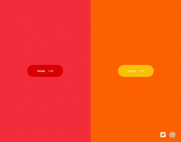
마우스를 올리면 화살표가 생기는 버튼 호버 효과입니다.
HTML 구조
<div class="btn-container">
<button>
<span class="text">Hover</span>
<div class="icon-container">
<div class="icon icon--left">
<svg>
<use xlink:href="#arrow-right"></use>
</svg>
</div>
<div class="icon icon--right">
<svg>
<use xlink:href="#arrow-right"></use>
</svg>
</div>
</div>
</button>
</div>
<div class="btn-container">
<button>
<span class="text">Hover</span>
<div class="icon-container">
<div class="icon icon--left">
<svg>
<use xlink:href="#arrow-right"></use>
</svg>
</div>
<div class="icon icon--right">
<svg>
<use xlink:href="#arrow-right"></use>
</svg>
</div>
</div>
</button>
</div>
<svg style="display: none;">
<symbol id="arrow-right" viewBox="0 0 20 10">
<path d="M14.84 0l-1.08 1.06 3.3 3.2H0v1.49h17.05l-3.3 3.2L14.84 10 20 5l-5.16-5z"></path>
</symbol>
</svg>
<div class="support">
</div>
CSS(SCSS) 소스
* {
box-sizing: border-box;
margin: 0;
padding: 0;
}
body {
width: 100%;
height: 100vh;
display: flex;
overflow: hidden;
}
.btn-container {
width: 100%;
height: 100%;
display: flex;
justify-content: center;
align-items: center;
background: var(--bg);
&:nth-child(1) {
--btn-bg: #da0000;
--bg: #f22c3a;
}
&:nth-child(2) {
--btn-bg: #fac300;
--bg: #fc6100;
}
}
button {
--width: 180px;
--height: 60px;
border: 0;
position: relative;
min-width: var(--width);
min-height: var(--height);
border-radius: var(--height);
color: #fff;
font-family: "Montserrat";
font-weight: bold;
background: rgba(0, 0, 0, 0.3);
cursor: pointer;
overflow: hidden;
display: flex;
justify-content: center;
align-items: center;
margin: 0 1rem;
.text,
.icon-container {
position: relative;
z-index: 2;
}
.icon-container {
--icon-size: 25px;
position: relative;
width: var(--icon-size);
height: var(--icon-size);
margin-left: 15px;
transition: transform 500ms ease;
.icon {
position: absolute;
left: 0;
top: 0;
width: var(--icon-size);
height: var(--icon-size);
transition: transform 500ms ease, opacity 250ms ease;
&--left {
transform: translateX(-200%);
opacity: 0;
}
svg {
width: 100%;
height: 100%;
fill: #fff;
}
}
}
&::after {
content: "";
position: absolute;
left: 0;
top: 0;
width: 100%;
height: 100%;
background: var(--btn-bg);
border-radius: var(--height);
z-index: 1;
transition: transform 500ms ease;
}
&:hover {
&::after {
transform: translateX(65%);
}
.icon-container {
transform: translateX(125%);
.icon {
&--left {
transform: translateX(0);
opacity: 1;
}
&--right {
transform: translateX(200%);
opacity: 0;
}
}
}
}
}
.support{
position: absolute;
right: 10px;
bottom: 10px;
padding: 10px;
display: flex;
a{
margin: 0 10px;
color: #fff;
font-size: 1.8rem;
backface-visibility: hidden;
transition: all 150ms ease;
&:hover{
transform: scale(1.1);
}
}
}
해당 사이트로 이동하여 전체 소스를 확인하실 수 있습니다.

'웹프로그램밍 자료실 > HTML 자료' 카테고리의 다른 글
| [해피CGI][cgimall] 원형 구조로 배치된 인포그래픽 UI 패턴 (0) | 2026.01.13 |
|---|---|
| [해피CGI][cgimall] SVG와 CSS-Doodle을 활용해 만들수 있는 클래식 기하학 패턴 (0) | 2026.01.12 |
| [해피CGI][cgimall] Gradient text border background Button With Animation 보더 그라디언트 버튼 (0) | 2025.12.03 |
| [해피CGI][cgimall] 인터랙티브 탄성(Elastic) 호버 메뉴 애니메이션 (0) | 2025.12.01 |
| [해피CGI][cgimall] CSS 기반 3D 페이지 플립 인터랙션 (0) | 2025.11.28 |


