

| 일 | 월 | 화 | 수 | 목 | 금 | 토 |
|---|---|---|---|---|---|---|
| 1 | 2 | 3 | 4 | |||
| 5 | 6 | 7 | 8 | 9 | 10 | 11 |
| 12 | 13 | 14 | 15 | 16 | 17 | 18 |
| 19 | 20 | 21 | 22 | 23 | 24 | 25 |
| 26 | 27 | 28 | 29 | 30 | 31 |
Tags
- #cgimall
- happycgi
- 솔루션
- #CSS
- #웹솔루션
- #happycgi
- #jQuery
- CSS
- 해피CGI
- #솔루션
- 해피씨지아이
- CGIMALL
- php
- #업종별
- #동영상
- jquery
- 이미지
- 웹솔루션
- #해피CGI
- 사이트제작
- #이미지
- 게시판
- 홈페이지제작
- #image
- #뉴스
- #홈페이지
- #쇼핑몰
- #홈페이지제작
- javascript
- 홈페이지
- Today
- Total
웹솔루션개발 26년 노하우! 해피CGI의 모든것
[해피CGI][cgimall] Interactive Liquid Glass Animation 본문
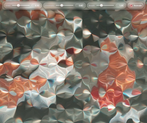
커서에 반응하는 유리 디자인 입니다.
웹 프로젝트에 세련되고 미래적인 분위기를 넣을 때 좋을 것 같습니다.
자세한 내용은 데모를 참고하시기 바랍니다.
HTML
|
<div class="toolbar">
<div class="pill">
<span class="lbl">Glass</span>
<input id="amp" type="range" min="0" max="1.5" value="0.5" step="0.01" />
<span id="ampVal" class="val">0.50</span>
</div>
<div class="pill">
<span class="lbl">Chromatic</span>
<input id="chrom" type="range" min="0" max="2" value="0.6" step="0.01" />
<span id="chromVal" class="val">0.60</span>
</div>
<div class="pill">
<span class="lbl">Breath</span>
<input id="speed" type="range" min="0" max="4" value="1.0" step="0.01" />
<span id="speedVal" class="val">1.00</span>
</div>
<label class="chk">
<input id="animate" type="checkbox" checked />
<span>Animate</span>
</label>
</div>
<div class="side">
<div class="card">
<div class="row">
<label>Cell</label>
<input id="cell" type="range" min="8" max="200" value="56" />
</div>
<div class="hint">
Scroll: change Cell • Drag: pan • Double-click: toggle wireframe
</div>
</div>
<div class="card">
<div class="tabs">
<button id="tabImg" class="tab">Image</button>
<button id="tabVid" class="tab active">Video</button>
</div>
<div id="imgPane" class="pane" style="display: none">
<label class="url">
<span>Image URL</span>
<input
id="imgUrl"
type="text"
placeholder="Paste CORS-enabled image URL"
/>
<button id="loadImg" type="button">Load</button>
</label>
</div>
<div id="vidPane" class="pane">
<label class="url">
<span>Video URL</span>
<input
id="vidUrl"
type="text"
placeholder="Paste CORS-enabled mp4/webm URL"
/>
<button id="loadVid" type="button">Load</button>
</label>
<div class="row small">
<button id="playPause" type="button">Pause</button>
<label class="row"
><input id="loop" type="checkbox" checked /> Loop</label
>
<label class="row"
><input id="mute" type="checkbox" checked /> Muted</label
>
</div>
</div>
</div>
</div>
<div class="shape-switch" role="group" aria-label="Cell shape">
<div class="seg">
<button class="seg-btn active" data-shape="0" title="Hex" aria-label="Hex">
<svg viewBox="0 0 24 24" class="ico" aria-hidden="true">
<polygon points="12,3 19,7 19,17 12,21 5,17 5,7" />
</svg>
</button>
<button class="seg-btn" data-shape="1" title="Square" aria-label="Square">
<svg viewBox="0 0 24 24" class="ico" aria-hidden="true">
<rect x="5" y="5" width="14" height="14" rx="2" />
</svg>
</button>
<button class="seg-btn" data-shape="2" title="Diamond" aria-label="Diamond">
<svg viewBox="0 0 24 24" class="ico" aria-hidden="true">
<polygon points="12,4 20,12 12,20 4,12" />
</svg>
</button>
<button
class="seg-btn"
data-shape="3"
title="Triangle"
aria-label="Triangle"
>
<svg viewBox="0 0 24 24" class="ico" aria-hidden="true">
<polygon points="12,4 20,18 4,18" />
</svg>
</button>
<button class="seg-btn" data-shape="4" title="Circle" aria-label="Circle">
<svg viewBox="0 0 24 24" class="ico" aria-hidden="true">
<circle cx="12" cy="12" r="8" />
</svg>
</button>
</div>
</div>
<canvas id="c"></canvas>
|
CSS
|
:root {
--bg: #07070a;
--panel: rgba(255, 255, 255, 0.1);
--panel-heavy: rgba(255, 255, 255, 0.16);
--stroke: rgba(255, 255, 255, 0.22);
--stroke-soft: rgba(255, 255, 255, 0.14);
--txt: #f4f4f6;
--muted: #c9c9cf;
--accent: #ff9a9c;
--accent-15: rgba(255, 154, 156, 0.15);
--accent-25: rgba(255, 154, 156, 0.25);
--accent-40: rgba(255, 154, 156, 0.4);
--blur: 12px;
--radius-xl: 12px;
--radius-pill: 999px;
--btn-bg: linear-gradient(
180deg,
rgba(255, 255, 255, 0.18),
rgba(255, 255, 255, 0.06)
);
--btn-inner: inset 0 1px 0 rgba(255, 255, 255, 0.25),
inset 0 0 0 1px rgba(255, 255, 255, 0.2);
--btn-shadow: 0 6px 24px rgba(0, 0, 0, 0.28), 0 2px 10px rgba(0, 0, 0, 0.2);
--glow: 0 0 0 4px var(--accent-15), 0 0 24px var(--accent-25);
}
html,
body {
height: 100%;
margin: 0;
background: radial-gradient(
1100px 700px at 20% -10%,
#1a0f12 0%,
#0c0b11 42%,
#07070a 100%
);
color: var(--txt);
font: 12px/1.2 -apple-system, BlinkMacSystemFont, Segoe UI, Roboto, Inter,
system-ui, sans-serif;
}
#c {
position: fixed;
inset: 0;
width: 100%;
height: 100%;
display: block;
}
.toolbar {
position: fixed;
top: 12px;
left: 50%;
transform: translateX(-50%);
z-index: 10;
display: flex;
gap: 6px;
align-items: center;
padding: 6px 8px;
backdrop-filter: blur(var(--blur)) saturate(1.05);
-webkit-backdrop-filter: blur(var(--blur)) saturate(1.05);
background: linear-gradient(
180deg,
rgba(255, 255, 255, 0.14),
rgba(255, 255, 255, 0.06)
);
border: 1px solid var(--stroke-soft);
border-radius: var(--radius-xl);
box-shadow: var(--btn-shadow);
}
.pill {
display: flex;
align-items: center;
gap: 8px;
padding: 6px 10px;
border-radius: var(--radius-pill);
background: var(--btn-bg);
border: 1px solid var(--stroke-soft);
box-shadow: var(--btn-shadow), inset 0 0 0 1px rgba(255, 255, 255, 0.1);
}
.pill .lbl {
font-size: 11px;
color: var(--muted);
letter-spacing: 0.2px;
}
.pill input[type="range"] {
width: 100px;
}
.pill .val {
font-variant-numeric: tabular-nums;
min-width: 36px;
text-align: right;
color: #fff;
background: rgba(255, 255, 255, 0.12);
padding: 2px 6px;
border-radius: 10px;
border: 1px solid rgba(255, 255, 255, 0.18);
box-shadow: inset 0 1px 0 rgba(255, 255, 255, 0.35);
}
.chk {
display: flex;
align-items: center;
gap: 6px;
padding: 6px 10px;
border-radius: var(--radius-pill);
background: var(--btn-bg);
border: 1px solid var(--stroke-soft);
box-shadow: var(--btn-shadow), var(--btn-inner);
}
.chk input {
accent-color: var(--accent);
transform: translateY(1px);
}
.side {
position: fixed;
left: 12px;
bottom: 12px;
z-index: 9;
display: grid;
gap: 10px;
max-width: min(92vw, 460px);
}
.card {
padding: 10px 12px;
border-radius: var(--radius-xl);
background: linear-gradient(
180deg,
rgba(255, 255, 255, 0.14),
rgba(255, 255, 255, 0.06)
);
border: 1px solid var(--stroke-soft);
box-shadow: var(--btn-shadow), inset 0 0 0 1px rgba(255, 255, 255, 0.08);
backdrop-filter: blur(var(--blur)) saturate(1.1);
-webkit-backdrop-filter: blur(var(--blur)) saturate(1.1);
}
.row {
display: flex;
align-items: center;
gap: 10px;
justify-content: space-between;
}
.row.small {
gap: 8px;
}
.card label {
color: var(--muted);
}
.hint {
opacity: 0.75;
font-size: 11px;
margin-top: 6px;
}
.tabs {
display: flex;
gap: 6px;
margin-bottom: 8px;
}
.tabs .tab {
padding: 6px 10px;
border-radius: 12px;
border: 1px solid var(--stroke-soft);
background: var(--btn-bg);
color: #e9e9ee;
cursor: pointer;
box-shadow: var(--btn-shadow), var(--btn-inner);
}
.tabs .tab.active {
color: #fff;
border-color: var(--accent-40);
box-shadow: var(--btn-shadow), 0 0 0 1px var(--accent-25) inset;
}
.url {
display: grid;
grid-template-columns: auto 1fr auto;
gap: 8px;
align-items: center;
}
.url input {
width: 200px;
padding: 8px 10px;
border-radius: 12px;
border: 1px solid var(--stroke-soft);
background: linear-gradient(
180deg,
rgba(255, 255, 255, 0.1),
rgba(255, 255, 255, 0.04)
);
color: #fff;
box-shadow: inset 0 1px 0 rgba(255, 255, 255, 0.25);
}
.url button,
.row button {
padding: 6px 10px;
width: 60px;
border-radius: 12px;
border: 1px solid var(--stroke-soft);
background: var(--btn-bg);
color: #fff;
cursor: pointer;
box-shadow: var(--btn-shadow), var(--btn-inner);
transition: transform 0.08s ease, box-shadow 0.2s ease;
}
.url button:hover,
.row button:hover {
box-shadow: var(--btn-shadow), 0 0 0 1px var(--accent-25) inset;
}
.url button:active,
.row button:active {
transform: translateY(1px) scale(0.99);
}
.shape-switch {
position: fixed;
right: 12px;
bottom: 12px;
z-index: 10;
padding: 6px;
background: linear-gradient(
180deg,
rgba(255, 255, 255, 0.14),
rgba(255, 255, 255, 0.06)
);
border: 1px solid var(--stroke-soft);
border-radius: var(--radius-xl);
box-shadow: var(--btn-shadow), inset 0 0 0 1px rgba(255, 255, 255, 0.08);
backdrop-filter: blur(var(--blur)) saturate(1.1);
-webkit-backdrop-filter: blur(var(--blur)) saturate(1.1);
}
.seg {
display: flex;
border-radius: 999px;
overflow: hidden;
background: rgba(255, 255, 255, 0.05);
border: 1px solid var(--stroke-soft);
}
.seg-btn {
display: grid;
place-items: center;
width: 34px;
height: 28px;
border: none;
background: transparent;
color: #e9e9ee;
cursor: pointer;
transition: background 0.15s ease, color 0.15s ease, transform 0.08s ease,
box-shadow 0.2s ease;
}
.seg-btn + .seg-btn {
border-left: 1px solid var(--stroke-soft);
}
.seg-btn .ico {
width: 16px;
height: 16px;
display: block;
fill: none;
stroke: currentColor;
stroke-width: 2;
stroke-linecap: round;
stroke-linejoin: round;
filter: drop-shadow(0 1px 0 rgba(255, 255, 255, 0.25));
}
.seg-btn:hover {
background: rgba(255, 255, 255, 0.08);
color: #fff;
}
.seg-btn:active {
transform: translateY(1px) scale(0.98);
}
.seg-btn.active {
color: var(--accent);
background: linear-gradient(
180deg,
rgba(255, 255, 255, 0.22),
rgba(255, 255, 255, 0.08)
);
box-shadow: inset 0 0 0 1px var(--accent-25), 0 0 30px var(--accent-15);
}
input[type="range"] {
-webkit-appearance: none;
appearance: none;
width: 240px;
height: 16px;
background: transparent;
outline: none;
}
input[type="range"]::-webkit-slider-runnable-track {
height: 6px;
border-radius: 8px;
background: linear-gradient(
180deg,
rgba(255, 255, 255, 0.35),
rgba(255, 255, 255, 0.1)
),
rgba(255, 255, 255, 0.06);
box-shadow: inset 0 1px 0 rgba(255, 255, 255, 0.4),
inset 0 0 0 1px rgba(255, 255, 255, 0.22), 0 2px 10px rgba(0, 0, 0, 0.28);
}
input[type="range"]::-webkit-slider-thumb {
-webkit-appearance: none;
appearance: none;
margin-top: -5px;
width: 16px;
height: 16px;
border-radius: 50%;
background: radial-gradient(
circle at 30% 30%,
rgba(255, 255, 255, 0.85) 0%,
rgba(255, 255, 255, 0.55) 45%,
rgba(255, 255, 255, 0.25) 100%
),
var(--btn-bg);
border: 1px solid rgba(255, 255, 255, 0.55);
box-shadow: 0 5px 14px rgba(0, 0, 0, 0.3), 0 0 0 3px var(--accent-15);
}
input[type="range"]:active::-webkit-slider-thumb {
box-shadow: 0 6px 16px rgba(0, 0, 0, 0.38), 0 0 0 5px var(--accent-25);
}
input[type="range"]::-moz-range-track {
height: 6px;
border-radius: 8px;
background: linear-gradient(
180deg,
rgba(255, 255, 255, 0.35),
rgba(255, 255, 255, 0.1)
),
rgba(255, 255, 255, 0.06);
box-shadow: inset 0 1px 0 rgba(255, 255, 255, 0.4),
inset 0 0 0 1px rgba(255, 255, 255, 0.22), 0 2px 10px rgba(0, 0, 0, 0.28);
}
input[type="range"]::-moz-range-thumb {
width: 16px;
height: 16px;
border: 1px solid rgba(255, 255, 255, 0.55);
border-radius: 50%;
background: radial-gradient(
circle at 30% 30%,
rgba(255, 255, 255, 0.85) 0%,
rgba(255, 255, 255, 0.55) 45%,
rgba(255, 255, 255, 0.25) 100%
),
var(--btn-bg);
box-shadow: 0 5px 14px rgba(0, 0, 0, 0.3), 0 0 0 3px var(--accent-15);
}
.seg-btn:focus-visible,
.url button:focus-visible,
.row button:focus-visible,
.tabs .tab:focus-visible,
input[type="range"]:focus-visible,
.url input:focus-visible,
.chk:has(input:focus-visible) {
outline: none;
box-shadow: var(--glow);
}
.url input::placeholder {
color: #f2f2f6;
opacity: 1;
}
.url input::-webkit-input-placeholder {
color: #f2f2f6;
opacity: 1;
}
.url input::-moz-placeholder {
color: #f2f2f6;
opacity: 1;
}
.url input:-ms-input-placeholder {
color: #f2f2f6;
opacity: 1;
}
.url input:focus::placeholder,
.url input:focus::-webkit-input-placeholder,
.url input:focus::-moz-placeholder,
.url input:focus:-ms-input-placeholder {
color: #e0e0e6;
}
.side .card .row.small input[type="checkbox"] {
accent-color: var(--accent);
}
.side .card .row.small input[type="checkbox"]:focus-visible {
outline: none;
box-shadow: 0 0 0 3px var(--accent-15);
border-radius: 4px;
}
@media (max-width: 600px) {
.pill input[type="range"] {
width: 84px;
}
.url input {
width: 160px;
}
.card input[type="range"] {
width: 170px;
}
.seg-btn {
width: 32px;
height: 26px;
}
.seg-btn .ico {
width: 15px;
height: 15px;
}
}
|
JS
const canvas = document.getElementById("c");
const gl = canvas.getContext("webgl");
if (!gl) {
alert("WebGL not supported");
throw new Error("WebGL not supported");
}
function resize() {
const dpr = Math.max(1, Math.min(2, window.devicePixelRatio || 1));
const w = Math.floor(innerWidth * dpr),
h = Math.floor(innerHeight * dpr);
if (canvas.width !== w || canvas.height !== h) {
canvas.width = w;
canvas.height = h;
gl.viewport(0, 0, w, h);
}
}
addEventListener("resize", resize);
resize();
. . . |

'웹프로그램밍 자료실 > HTML 자료' 카테고리의 다른 글
| [해피CGI][cgimall] 인터랙티브 탄성(Elastic) 호버 메뉴 애니메이션 (0) | 2025.12.01 |
|---|---|
| [해피CGI][cgimall] CSS 기반 3D 페이지 플립 인터랙션 (0) | 2025.11.28 |
| [해피CGI][cgimall] Card Beam Animation (0) | 2025.11.13 |
| [해피CGI][cgimall] Custom checkbox 커스텀 체크박스 (0) | 2025.10.31 |
| [해피CGI][cgimall] Modal Animations 다양한 모달 에니메이션 효과 (0) | 2025.10.30 |
'웹프로그램밍 자료실/HTML 자료' Related Articles
more


Comments