

| 일 | 월 | 화 | 수 | 목 | 금 | 토 |
|---|---|---|---|---|---|---|
| 1 | 2 | 3 | 4 | |||
| 5 | 6 | 7 | 8 | 9 | 10 | 11 |
| 12 | 13 | 14 | 15 | 16 | 17 | 18 |
| 19 | 20 | 21 | 22 | 23 | 24 | 25 |
| 26 | 27 | 28 | 29 | 30 | 31 |
Tags
- #happycgi
- #cgimall
- 이미지
- #쇼핑몰
- 홈페이지
- #image
- #업종별
- #뉴스
- jquery
- #홈페이지
- #이미지
- #웹솔루션
- #솔루션
- CGIMALL
- CSS
- #홈페이지제작
- 해피CGI
- #CSS
- 솔루션
- 해피씨지아이
- 게시판
- #동영상
- #해피CGI
- 홈페이지제작
- 사이트제작
- #jQuery
- 웹솔루션
- javascript
- php
- happycgi
- Today
- Total
웹솔루션개발 26년 노하우! 해피CGI의 모든것
[해피CGI][cgimall] Dynamic fancy buttons 본문
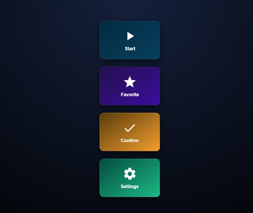
마우스 오버 시 버튼 디자인이 바뀌는 코드입니다.
카드 디자인으로 다이나믹한 사이트를 제작할 때 유용할거 같습니다.
자세한 내용은 데모를 참고해 주시기 바랍니다.

HTML
CSS
JS
자세한 내용은 데모를 참고해 주시기 바랍니다.
HTML
|
<main class="wrap">
<button class="btn-3d btn-1">
<div class="inner">
<svg viewBox="0 0 24 24">
<path d="M8 5v14l11-7z" />
</svg>
<div class="label">Start</div>
</div>
</button>
<button class="btn-3d btn-2">
<div class="inner">
<svg viewBox="0 0 24 24">
<path d="M12 17.27 18.18 21l-1.64-7.03L22 9.24l-7.19-.61L12 2 9.19 8.63 2 9.24l5.46 4.73L5.82 21z" />
</svg>
<div class="label">Favorite</div>
</div>
</button>
<button class="btn-3d btn-3">
<div class="inner">
<svg viewBox="0 0 24 24">
<path d="M9 16.17 4.83 12l-1.42 1.41L9 19 21 7l-1.41-1.41z" />
</svg>
<div class="label">Confirm</div>
</div>
</button>
<button class="btn-3d btn-4">
<div class="inner">
<svg viewBox="0 0 24 24">
<path d="M19.14 12.94c.04-.31.06-.63.06-.94s-.02-.63-.06-.94l2.03-1.58a.5.5 0 0 0 .12-.64l-1.92-3.32a.5.5 0 0 0-.6-.22l-2.39.96a7.025 7.025 0 0 0-1.62-.94l-.36-2.54A.5.5 0 0 0 14 2h-4a.5.5 0 0 0-.5.42l-.36 2.54c-.59.23-1.13.54-1.62.94l-2.39-.96a.5.5 0 0 0-.6.22L2.61 8.84a.5.5 0 0 0 .12.64l2.03 1.58c-.04.31-.06.63-.06.94s.02.63.06.94l-2.03 1.58a.5.5 0 0 0-.12.64l1.92 3.32c.14.24.43.34.7.22l2.39-.96c.49.4 1.03.71 1.62.94l.36 2.54a.5.5 0 0 0 .5.42h4a.5.5 0 0 0 .5-.42l.36-2.54c.59-.23 1.13-.54 1.62-.94l2.39.96c.27.11.56.02.7-.22l1.92-3.32a.5.5 0 0 0-.12-.64l-2.03-1.58zM12 15.5A3.5 3.5 0 1 1 15.5 12 3.5 3.5 0 0 1 12 15.5z" />
</svg>
<div class="label">Settings</div>
</div>
</button>
</main>
|
CSS
|
:root {
--bg: #0f1724;
--accent1: #06b6d4;
--accent2: #7c3aed;
--accent3: #f59e0b;
--accent4: #10b981;
--light: #fff;
font-family: Inter, system-ui, sans-serif;
}
body {
margin: 0;
display: flex;
align-items: center;
justify-content: center;
height: 100vh;
background: radial-gradient(circle at top, #14213d, #000);
color: var(--light);
}
.wrap {
display: grid;
grid-template-columns: repeat(auto-fit, minmax(220px, 1fr));
gap: 24px;
}
.btn-3d {
background: none;
border: none;
perspective: 1000px;
cursor: pointer;
position: relative;
}
.inner {
background: rgba(255, 255, 255, 0.05);
border: 1px solid rgba(255, 255, 255, 0.1);
border-radius: 14px;
height: 130px;
display: flex;
flex-direction: column;
align-items: center;
justify-content: center;
gap: 10px;
transform-style: preserve-3d;
transition: transform 0.4s cubic-bezier(0.18, 0.9, 0.32, 1), box-shadow 0.3s;
box-shadow: 0 10px 25px rgba(0, 0, 0, 0.5);
}
.btn-3d:hover .inner {
transform: rotateX(12deg) rotateY(-10deg) translateY(-8px);
box-shadow: 0 15px 30px rgba(0, 0, 0, 0.6);
}
.btn-3d:active .inner {
transform: translateY(2px) scale(0.97);
}
.label {
font-weight: 600;
font-size: 16px;
color: var(--light);
}
svg {
width: 50px;
height: 50px;
fill: var(--light);
transition: transform 0.6s ease, fill 0.3s ease, filter 0.4s ease;
filter: drop-shadow(0 0 0 transparent);
}
/* Accent per knop */
.btn-1 .inner {
background: linear-gradient(145deg, #022c43, #053f5e);
}
.btn-2 .inner {
background: linear-gradient(145deg, #24104f, #3a0ca3);
}
.btn-3 .inner {
background: linear-gradient(145deg, #5a3d00, #f59e0b);
}
.btn-4 .inner {
background: linear-gradient(145deg, #004d40, #10b981);
}
.btn-1:hover svg {
transform: scale(1.3) rotate(10deg);
fill: #06b6d4;
filter: drop-shadow(0 0 10px #06b6d4);
}
.btn-2:hover svg {
transform: scale(1.3) rotate(10deg);
fill: #7c3aed;
filter: drop-shadow(0 0 10px #7c3aed);
}
.btn-3:hover svg {
transform: scale(1.3) rotate(10deg);
fill: #f59e0b;
filter: drop-shadow(0 0 10px #f59e0b);
}
.btn-4:hover svg {
transform: scale(1.3) rotate(10deg);
fill: #10b981;
filter: drop-shadow(0 0 10px #10b981);
}
/* animatie bij klik */
.pulse {
animation: pulse 0.5s ease, glow 0.5s ease;
}
@keyframes pulse {
0% {
transform: scale(1);
}
50% {
transform: scale(1.25);
}
100% {
transform: scale(1);
}
}
@keyframes glow {
0% {
filter: drop-shadow(0 0 0 transparent);
}
50% {
filter: drop-shadow(0 0 14px currentColor);
}
100% {
filter: drop-shadow(0 0 0 transparent);
}
}
|
|
document.querySelectorAll(".btn-3d").forEach((btn) => {
btn.addEventListener("click", () => {
const svg = btn.querySelector("svg");
svg.classList.add("pulse");
setTimeout(() => svg.classList.remove("pulse"), 500);
});
});
|

'웹프로그램밍 자료실 > 기타 자료' 카테고리의 다른 글
| [해피CGI][cgimall] Audacity - 무료, 오픈 소스 오디오 편집의 표준 (0) | 2025.11.18 |
|---|---|
| [해피CGI][cgimall] 서버 오류 페이지 콘셉트 타이포 애니메이션 디자인 (500 Error) (0) | 2025.11.11 |
| 브라우저에서 카메라를 활용하여 심박 체크를 해주는 사이트 heartrate.netlify.app (0) | 2025.10.13 |
| [해피CGI][cgimall] json 데이터를 보기 좋게 보여주는 사이트 jsoncrack.com (0) | 2025.10.10 |
| [해피CGI][cgimall] 고퀄리티 브랜드 로고를 받을 수 있는 사이트 - brandfetch.com (0) | 2025.08.26 |
'웹프로그램밍 자료실/기타 자료' Related Articles
more


Comments