

| 일 | 월 | 화 | 수 | 목 | 금 | 토 |
|---|---|---|---|---|---|---|
| 1 | 2 | 3 | 4 | |||
| 5 | 6 | 7 | 8 | 9 | 10 | 11 |
| 12 | 13 | 14 | 15 | 16 | 17 | 18 |
| 19 | 20 | 21 | 22 | 23 | 24 | 25 |
| 26 | 27 | 28 | 29 | 30 |
Tags
- #happycgi
- happycgi
- #cgimall
- jquery
- 해피CGI
- 이미지
- #jQuery
- 사이트제작
- #솔루션
- 해피씨지아이
- 게시판
- #CSS
- 홈페이지
- CGIMALL
- #쇼핑몰
- #동영상
- #업종별
- #image
- 홈페이지제작
- php
- #웹솔루션
- CSS
- #홈페이지
- #이미지
- #뉴스
- javascript
- 웹솔루션
- #해피CGI
- #홈페이지제작
- 솔루션
- Today
- Total
웹솔루션개발 26년 노하우! 해피CGI의 모든것
[해피CGI][cgimall] css3로 제작가능한 호버효과 본문
css3을 이용하여 이미지에 호버이펙트를 다양하게 사용할 수 있습니다.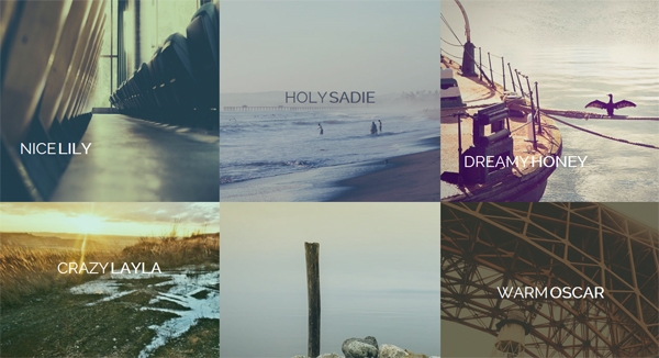
마우스올렸을때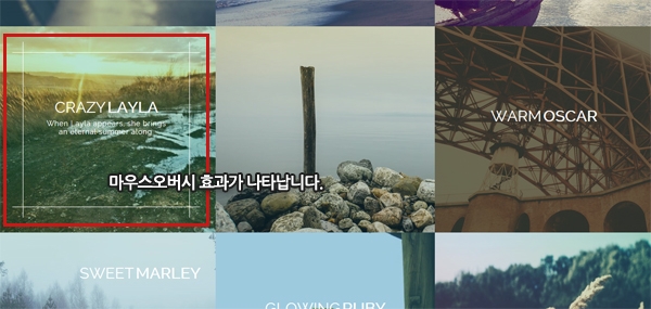
제각각 다른 효과를 미리보기로 확인할 수 있습니다.
기본구조
<div class="grid"> <figure class="effect-lily"> <img src="img/1.jpg" alt="img01"/> <figcaption> <h2>Nice <span>Lily</span></h2> <p>Lily likes to play with crayons and pencils</p> <a href="#">View more</a> </figcaption> </figure> <!-- ... --> </div>
사용 css3
figure.effect-sadie figcaption::before { position: absolute; top: 0; left: 0; width: 100%; height: 100%; background: linear-gradient(to bottom, rgba(72,76,97,0) 0%, rgba(72,76,97,0.8) 75%); content: ''; opacity: 0; transform: translate3d(0,50%,0);} figure.effect-sadie h2 { position: absolute; top: 50%; left: 0; width: 100%; color: #484c61; transition: transform 0.35s, color 0.35s; transform: translate3d(0,-50%,0);} figure.effect-sadie figcaption::before,figure.effect-sadie p { transition: opacity 0.35s, transform 0.35s;} figure.effect-sadie p { position: absolute; bottom: 0; left: 0; padding: 2em; width: 100%; opacity: 0; transform: translate3d(0,10px,0);} figure.effect-sadie:hover h2 { color: #fff; transform: translate3d(0,-50%,0) translate3d(0,-40px,0);} figure.effect-sadie:hover figcaption::before ,figure.effect-sadie:hover p { opacity: 1; transform: translate3d(0,0,0);} |
Comments